Image visualization is an amazing world. Dealing with different ways of telling a story and representing your data can be very challenging. I found very useful the use of Heat Maps while exploring the different tools available. Looking into a dataset of New York City Apartment rental listing data, I organized the different amenities, number of rooms and ratio of beds to baths in a way that I could look into these prices in different perspectives. I took the decision to transform all the categorical features into numeric features, so for example, having a pool instead of yes or no would be 0 for no and 1 for yes. One of the visualizations I ended up with, it was a heat map showing rooms against apartment description/amenities/perks which is shown below:
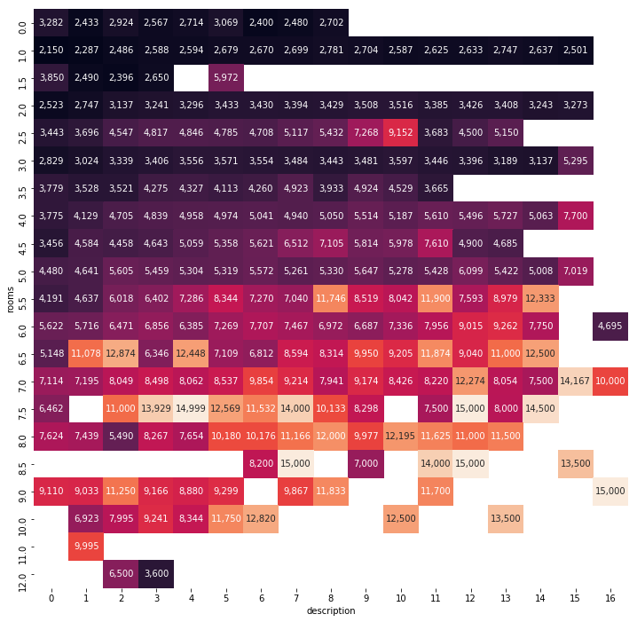
This shows that the higher description numbers (number of perks/amenities) and the higher number of rooms: higher rental prices. These colors are represented in a way that the most expensive rents are more orange, tending to be lighter and the cheapest rents are more blueish tending to be darker. With the color you can check as well the average rent price of an apartment in each specific description and number of rooms category.